Staging for great photos – here’s some great tips for getting the perfect look and making that property shine in photos.
- Design for the camera, not for the end user.
When putting together a space, we always think of the camera first. Will this angle look right, will it show off the best feature of the house? Will the light hit these items correctly? The good news is you have a camera in your pocket as you read this. When we stage a house for market, we are constantly taking photographs of it and looking at it through the camera lens. It helps us to see errors in symmetry, lighting, cleanliness, etc.
- No more wrinkles.
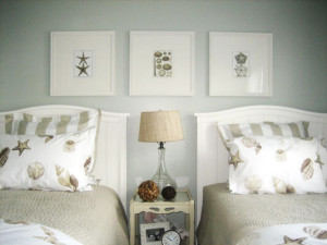
 In real life, wrinkly sheets don’t make a lick of difference. The camera, however, hates wrinkles and makes them look 100 times worse than they really are. Our best advice on this one is to use a professional steamer. The hot steam will take those wrinkles right out and makes the sheets, pillow shams and draperies look perfect in the picture.
- Light it up.
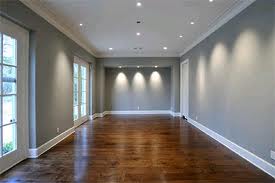
Light can be your best friend or your worst enemy. If you don’t know how to control it, you are destined to fail. The time of day and weather conditions can make a huge difference on how well your space photographs. If the afternoon sun is blazing into your room throwing harsh shadows all over, the shot is destined to look “blown out” with areas as dark as night and as bright as a nuclear holocaust. To help combat this problem, look for the best time for indirect sunlight outside and inside your space. It is also a great idea to turn on your interior lights and lamps, this will help to even out the lighting in the space.
-
 Fluff the carpet.
So often we see houses photographed with harsh vacuum lines or matted carpet that looks old and tired. The best way to fluff up your tired wall to wall is to use a broom. Running the broom over the top of the carpet in random directions will bring new life to a sagging floor textile.
- Look beyond the window.
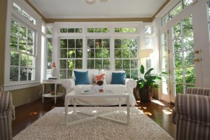
It’s true enough you are photographing the interiors of your space but the outside of your windows will be seen in the photos. If there are piles of trash covered with blue tarps right outside your window, they are going to come through in the photos. Clean up the areas outside the window and make it visually quiet so it does not draw attention to itself. If the area can’t be cleaned up, consider a frosted film on the window.
- Limit the color scheme.
There are neutrals and there are colors. The neutrals are black, white, grey, brown, beige, cream, silver, and sometimes gold. You can put as many different neutrals in a room as you want. They can form a great base for your color. The colors are the rainbow: red, orange, yellow, green, blue and purple. Colors must be used with great restraint. We endeavor to have only one “color story” per room. A color story might be blues or reds or colors of the peacock, or teal and yellow. If you have more than one color story per room, the photographs will start to look chaotic and visually noisy.
- Rely on symmetry, repetition, rhythm.
Symmetry, repetition, and rhythm can be found throughout nature and humans find them to be aesthetically pleasing. Symmetry can be found in most animals and insects. Repetition is why we find flowers so pleasing. Rhythm can be found in the ripples of a sand dune. A quick and easy way to make a space more aesthetically pleasing is to use these simple principles of good design.
- Look at the problem from a different angle, then design for the best one.
What is the first impression going to be? Design for that view and the rest will fall into place. Figure out where the camera will most likely be and make every decision for the room based on that. Chances are, it will turn out great.
- Hire a professional.
Don’t invest the time to decorate and then run through with an iPhone and snap 16 horrible pictures. If you want great photographs, hire a great photographer.
- Put down the toilet seat.
No explanation needed.
- Get out of the mirror.
Make sure there is no one in the mirror reflecting back with a camera.
-
 Furnish the house, but don’t over decorate the cake.
Empty houses are hard to see. Furniture provides scale, shows use, and adds light to spaces. Without it, the space is just walls, windows, floors, and ceilings. It is important to show how the space is used and how big the space is. Once you have taken care of these items, then stop decorating. There is a point when the decoration is no longer about the house but more so about the decoration. Stop before you get there.
 " alt="" />